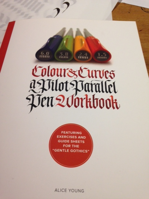
Practice: Colour and Curves: A Pilot Parallel Pen Workbook (cont.)

I have delved into the Gentle Gothics section of Colour and Curves.  I need to get a 3.8mm Pilot Parallel pen.  I am working with the 6.0mm.  It is too thick, but I will make due until I get the smaller nib width. 

Anyway, I appreciated the brief history review of Gothic/ Blackletter as well as the brush-up on ratio.  I think ratio is my biggest challenge.  I believe mastering ratios in muscle memory and visually will take my lettering to the next level.

This week Friday, August 17 at Oil and Cotton I am teaching Intro to Calligraphy from 6:30-9p using the 2.4 mm Pilot Parallel Pen.

Practice: Colour & Curves: A Pilot Parallel Pen Workbook

I have started Colour & Curves: A Pilot Parallel Pen Workbook by Alice Young. 

I am excited to get back into some broad-pen practice.  This book is very good and thorough about the Pilot Parallel Pen. I've already got some great pointers on how to clean the pen and a few tips about books for left-handed calligraphers.  The Parallel Pen does not clog often, but getting a look into how the pen is put together and what the tools that come with the pen are for, will be nice information to pass on to my calligraphy students at Oil and Cotton.  I teach the Intro to Calligraphy class (coming up on Friday, August 17 at 6:30P) with the 2.4 mm Pilot Parallel Pen.  I get a few left handed students now and then, so any tips I can pick up to tell them are always welcome.

I have just began with exercises one and two, but can already tell this book will improve my broad-pen work. 

IMG_2095.JPG

Practice: Lettering in the Whimsical Woodlands (final week)

I have wrapped up Lettering in the Whimsical Woodlands with the Composition section. 

I enjoyed Lettering in the Whimsical Woodlands...my line drawing been rescued from the rust is was buried under and my brush pen lettering has improved greatly.  I still need to work on my hairline strokes and applying more pressure to the brush pens, but it's coming along.

I will do the projects suggested in the back, but I have complete my blog sharing portion of this book.  I will post any projects I do on Instagram.

Now onto Colour and Curves: A Pilot Parallel Pen Workbook by Alice Young.

37809324_1512193705552095_6279459241514237952_o.jpg
37653791_1512193155552150_2577893904258957312_o.jpg
37742687_1512206375550828_5584349085650911232_o.jpg
FullSizeRender(16).jpg

Practice: Lettering in the Whimsical Woodlands (cont.)

This week I am in the Draw What You See: Wildflowers section of Lettering in the Whimsical Woodlands.  Peggy Dean helped me see I can do just that..."Draw what you see." I walked around my yard and looked for wildflowers, loose twigs with a few leaves still attached, herbs, etc. Then,  I brought them in, laid the each plant next to the place I was going to draw, and drew what I saw starting with the stem as recommended. 

Next, week I will start on the Borders section.

Practice: Lettering in the Whimsical Woodlands (cont.)

I have moved on to the Let's Draw section in Lettering in the Whimsical Woodlands and I am giggling with myself at my attempts at the woodland creatures.  My mushrooms, flowers and other vegetal forms are not as cartoonish.  I am enjoying the process of revealing my illustration voice.  Next, I am moving on to Draw What You See: Wildflowers.

36188516_1471516399619826_6431281825712177152_o.jpg

Practice: Lettering in the Whimsical Woodlands (cont.)

I have traced through the Burrow, Flutter, and Frolic brush pen styles from Lettering in the Whimsical Woodlands.  I am still having issues slowing down and avoiding falling into strokes I would use for Copperplate.  These styles are loose, but not out of control. They are also more open and can stray from the baseline.  This makes it more imperative to maintain balance between a flowing appearance and actually going too quickly.

I am moving on to drawing/illustrations.  It has me giggling. You will see why next week.

35488784_10211923136050169_1235267057147183104_o.jpg

Practice: Lettering in the Whimsical Woodlands (cont.)

I am wrapping up Mastering Copperplate Calligraphy. It is difficult to pick a few sentences to highlight chapters 8,9, and 10.  Chapter 8: Writing Out a Page, Chapter 9: Commercial Calligraphy and Chapter 10: Retouching, Correcting and Cropping emphasize the importance of layout, considering colors, considering margins, practice, developing a reliable copperplate, and wabi-sabi (the acceptance of transience and imperfection). I picked up invaluable information from this book. 

In Letting in the Whimsical Woodlands, I moved on to the basic strokes for brush pen calligraphy.  I will trace out the Burrow and Flutter alphabets next, then it's on to drawing/illustration. 

Last, week  I attended the Helen Warren DeGolyer Bookbinding Conference with the Book Doctor crew.  It was an enriching experience.  I took two workshops: Tunnel Book with Maria Pisano and Japanese Stab Binding with Bexx Caswell-Olson.  Both were super fun and informative.

This Saturday at the Tally Dunn Gallery at 6:30p, Cynthia Mulcahy: War Garden.  I have had a wonderful time contributing to this beautifully rich body of work over this past couple of years. It helped me grow as a calligrapher, friend, US citizen, etc.

FullSizeRender(13).jpg
IMG_1847.JPG

Practice: Lettering in the Whimsical Woodlands (cont.)

I am continuing to read the last several chapters of Mastering Copperplate Calligraphy.  Here are a few tips I must share. 

Chapter 5: Changing the Size of Letters

To write smaller, decrease the pressure on your nib on the downstroke and make all the strokes closer together.  When writing larger, the downstrokes must be heavier, and the counter and inter-spaces must be wider in proportion to the greater height of the letters. No matter what size your letters are, letters made with the same nib will have hairlines of the same weight.  This is one reason why copperplate is more difficult to read when written large.

Chapter 6: Writing in Color

For the color to flow easily from your nib, it is essential that you use a water-based paint.  Gouache is the most common opaque water-based paint used for calligraphy. 

Chapter 7: Using Good Paper

Paper that is good for calligraphy has a writing surface that is neither so rough that the nib catches, nor so smooth that it slips and slides. 

This is great information for continuing through Lettering in the Whimsical Woodlands. This week I am working on faux calligraphy, which is better for making larger script or cursive lettering.

Yesterday, I took a color theory class with Delaney Smith of Eyeland Studios at Oil and Cotton. It was illuminating and also great for things I am currently working on.

This Friday, June 8 at 6:30p I am teaching Pen and Ink Calligraphy at Oil and Cotton, in which we will cover Foundation Hand and make accordion style booklets.

34411620_1445625145542285_7083456778360324096_o.jpg

Practice: Lettering in the Whimsical Woodlands: A Creative Calligraphy Adventure by Peggy Dean

I am done with the visual sharing portion of posting my practice from Mastering Copperplate Calligraphy: A Step-by-Step Manual by Eleanor Winters.  I will share any interesting tips I wish to highlight from the remaining chapters 5-10: 5) Changing the Size of the Letters, 6) Writing in Color, 7) Using Good Paper, 8) Writing Out a Page, 9) Commercial Calligraphy and 10) Retouching, Correcting and Cropping. 

This week I am moving on to the next book from my selves, Lettering in the Whimsical Woodlands: A Creative Calligraphy Adventure: Nature-Inspired Projects, Prompts, and Drawing Ideas by Peggy Dean.  I am using a Tombow Fudenosuke hard tip brush pen, and starting in the first section with letter shapes. 

I like the statement, "Lettering is not writing; it's drawing".  It is a fact to me.  It sets the stage for me to continue practice with the intention of incorporating way more illustrations and finding my own style.

'Epistolary Paper Quilt, Falling Action II' will be on display at the Oak Cliff Culture Center as part of 214Art Juried Exhibition thru June 1.

FullSizeRender(16).jpg

Practice: Mastering Cooperplate Calligraphy: A Step-by-Step Manual (final week)

I am in Chapter 4 this week...Numbers and Punctuation.  I have not been very pleased with my numbers...ever.  I figure it is definitely because I do not write numbers nearly as often as I write letters.  Practice makes perfect.

I had a wonderful weekend participating in the Speedbump Tour, an annual tour held this time of year by my brothers from other mothers, Brian Jones and Brian Scott, a.k.a. Chuck and George.  It was super fun and gave me the inspiration to clean my studio. I had visits from various wonderful artists: Lisa Rawlinson, Scott Winterrowd, Chesley Antoinette, Cynthia Mulcahy, Tina Medina, Delaney Smith, Scott Wayne McDaniel, Cynthia Ann Miro-McDaniel, Jessica Rae Pleasant...just to name a few. 

'Epistolary Paper Quilt, Falling Action II' will be on display at the Oak Cliff Culture Center as part of 214Art Juried Exhibition thru June 1.

Photo by Scott Wayne McDaniel (Rae Pleasant, me, Chesley Antoinette)

Photo by Scott Wayne McDaniel (Rae Pleasant, me, Chesley Antoinette)

Photo by Scott Wayne McDaniel

Photo by Scott Wayne McDaniel

32565082_1426434584128008_7646350892911820800_o.jpg
FullSizeRender(15).jpg

Practice: Mastering Cooperplate Calligraphy: A Step-by-Step Manual (cont.)

I am still in the Variations section of Chapter 3.  I am continuing enjoy expanding my visual vocabulary and muscle memory for creating flourishing soon.

Epistolary Quilt, Falling Action II is still on view until June 1, 2018 in the ART214 Juried Exhibition at the Oak Cliff Cultural Center.

I loved the sign making class with Johanne Grinde at Oil and Cotton Friday, May 11, 2018. Her gestural approach to signing making was helpful and refreshing. 

32565082_1426434584128008_7646350892911820800_o.jpg
32498231_1425817394189727_3493151233173094400_o.jpg

Practice: Mastering Cooperplate Calligrpahy: A Step-by-Step Manual (cont.)

Still in working away in Chapter 3 with the capitals.  I am continuing to see improvements.  I can't wait to start getting a little more bold with flourishing, but first...reinforcing the fundamentals. 

Also, one of my Epistolary Paper Quilts got into the ART214 Juried Exhibiton at the Oak Cliff Cultural Center and will be on display there with many other extremely talented artist until June 1, 2018.  I am so honored to be counted among the likes of them. 

Photo by David R. Kirkland

Photo by David R. Kirkland

Practice: Mastering Copperplate Calligraphy:A Step-by-Step Manual (cont.)

I am continuing with Chapter 3 and working on the capital letters.  I am concentrating on pausing for a full stop between strokes to get the squared off termination to the tops and bottoms of the stems on some letters.  I am also focusing on the fact that Copperplate is NOT running hand style...meaning you lift your pen often when writing as opposed to keeping your pen on the page while writing full words.  I can see the improvements.

Photo by Takisha Roberson

Photo by Takisha Roberson

Practice: Mastering Copperplate: A Step-by-Step Manual

I have started Chapter 3, The Capital Letters.  I am feeling a little better about slowing down, and understanding how to have the stems of some of my letters terminate flatter.  I am getting down the basic strokes for capitals before I begin forming the letters. 

Intro to Calligraphy at Oil and Cotton went great last week.  Takisha Roberson took amazing photos of the class.  More to come.

Practice: Mastering Copperplate Calligraphy: A Step-by-Step Manual (cont.)

I am continuing in Chapter 2 by wrapping up the final section on 'Variations on the Minuscules'.  I am still struggling with even pressure and slowing down my writing, and the letter forms are pretty good, but not great. I will keep practicing. I am still practicing with pencil. I will switch back to ink to start out the capitals.

I have a class this Friday, April 13 at Oil and Cotton from 6:30-9p.  In Intro to Calligraphy we will cover warm-ups, how to hold your pen (we will be working with a classroom set of Pilot Parallel pens (2.4mm)), as well as the flourished Italic lowercase, number, and uppercase. My friend, photographer, Takisha Roberson, will be taking photos of all the action this week.  I will also bring a variety to of helpful and interesting calligraphy books.